
-
Let's take your brand to the next level!
contact@designatastudio.com +62.822 9888 2757 -
Do you have a big passion for making a real difference? Join us!
jobs@designatastudio.com -
Taman Kemayoran Condomimium
Bougenville Tower 307
Jl. H. Benyamin Sueb • Jakarta Pusat • 10630
Year2019
ClientsBebek Kaleyo
Scope of Works PACKAGING | IDENTITY | PRINTED MEDIA | DIGITAL MEDIA | ENVIRONMENT & OTHERS
Website http://www.kaleyo.com/
Bebek Kaleyo Branding
Elevates the visual identity that fits the target market
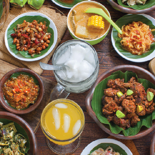
Started as a street stall, Bebek Kaleyo has climbed its success to be one of the biggest restaurants in Jakarta. Like the name, the main dish they serve is duck, but they have other menus that are just as good. Their goal is to serve tasty yet affordable food with a nice comfortable place to complement the experience.
Branding is an ongoing process, along the way Bebek Kaleyo brand is growing and developing. Hence, we redesign their visual identity following their growth. This is the second time we rejuvenate the Bebek Kaleyo brand; its key visual, menu, website, and packaging.

The challenge:
With the price they have, their target market is the middle-lower class. We want to create something to show how affordable their product is without having to look cheap. The competition in the F & B world is not only selling food but also their brand concept and interior design, it creates an intense rivalry between each brand. Bebek Kaleyo has done such an upgrade in their interior appearance, so it’s time for them to refresh their overall visual identity, maintain their existing consumers, and gain a younger target market.

The solution:
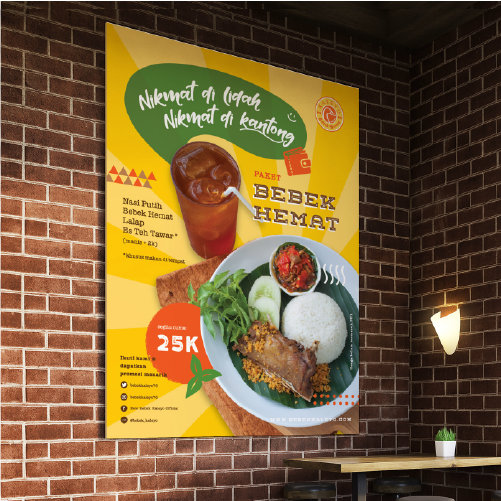
Our main focus on this project is to create a strong visual identity that can represent their witty style of communication and to be easily remembered, especially to their target market. With such colorful key visuals, it gives a pleasant experience to their consumers. It also makes their brand more attractive and dynamic.
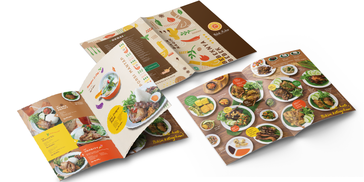
We choose colorful themes with their food ingredient illustrations to show their joyful style. We make sure that the bright and warm color combination in the design can represent their everlasting vision, everyone deserves to enjoy good quality food without spending too much.


Let's take your brand to the next level!
Taman Kemayoran Condomimium
Bougenville Tower 307
Jl. H. Benyamin Sueb
• Jakarta Pusat • 10630
Do you have a big passion for making a real difference? Join us!

© 2021 Designata Studio. All Rights Reserved