
-
Let's take your brand to the next level!
contact@designatastudio.com +62.822 9888 2757 -
Do you have a big passion for making a real difference? Join us!
jobs@designatastudio.com -
Taman Kemayoran Condomimium
Bougenville Tower 307
Jl. H. Benyamin Sueb • Jakarta Pusat • 10630
Year2022
ClientsMIC
Scope of Works PACKAGING | IDENTITY
Website
Kaila Rebranding
Renew, Rebrand, Radiate. Bold Approach to Affordable Skincare
Every woman dreams of achieving glowing and healthy skin, and Kaila has embraced a rejuvenation of its brand to offer a comprehensive range of skincare products at accessible prices.
Our focus lies on young, confident women who relish being at the center of attention. Positioned in the middle to lower price segment, our target market prioritizes both affordability and the benefits of our products.
-02.png)
The design of the Kaila logo exudes confidence and simplicity. Its few stars symbolize product efficacy and evoke an air of elegance. Its simplicity ensures ease of creation, validation, and readability. Kaila boasts a bold and trendy personality, presenting a modern, young, fresh aesthetic through vibrant and contrasting colors that express its unique personality.
-03.png)
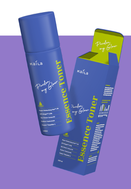


A catchy phrase has been included in the front panel design to add a touch of humor. The rebranded Kaila looks modern and attractive and communicates its essence through a unique combination of typography, layout, and colors. Complemented by icon designs intricately shaped to harmonize with the Kaila logo, each product's unique selling proposition is highlighted with clarity, reinforcing Kaila's commitment to redefining skincare experiences.
-06.jpg)
Let's take your brand to the next level!
Taman Kemayoran Condomimium
Bougenville Tower 307
Jl. H. Benyamin Sueb
• Jakarta Pusat • 10630
Do you have a big passion for making a real difference? Join us!

© 2021 Designata Studio. All Rights Reserved