
-
Let's take your brand to the next level!
contact@designatastudio.com +62.822 9888 2757 -
Do you have a big passion for making a real difference? Join us!
jobs@designatastudio.com -
Taman Kemayoran Condomimium
Bougenville Tower 307
Jl. H. Benyamin Sueb • Jakarta Pusat • 10630
Year2017
ClientsMIC
Scope of Works PACKAGING
Website
Pigeon Baby
Capturing caring and nurturing of mother’s love in packaging
Pigeon is a trusted baby care brand from Japan that was built in 1957 by Yuichi Nakata. Its mission is to deliver high-quality, durable, and user-friendly babies and toddlers’ products for mothers around the world. Pigeon Baby Indonesia gives us the opportunity to rejuvenate their packaging design. It’s such a good opportunity and an exciting challenge for us since Pigeon is a big brand that has been in the market for a long period of time and has powerful brand awareness.

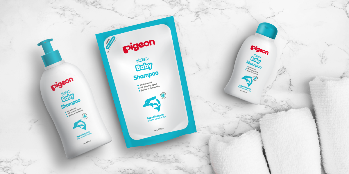
They want to use the same bottle but with a fresher look that can distinguish them from the other competitors while still being recognized by their consumers. The leading goal for us is to show the USP (unique selling point) of this product by adding interesting complement icons. We use illustrations of mother and baby animals to portray the caring and protecting concept which is the foundation of this product.
By using the positive-negative form, we can fit the design in printing color limitation and sweep in our creativity to adjust the illustration in the 3 non-gradation colors. The illustration is also aligned with the meaning of the letter “P” in the Pigeon logo, showing a mother’s and her baby’s heart, a symbol of a never-ending bond and love.


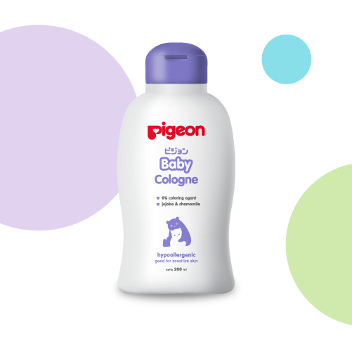

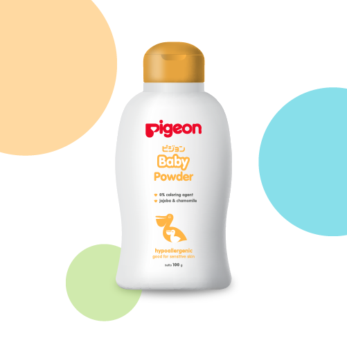
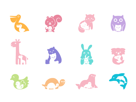
There are 14 categories of baby care products and we want to ensure each category stands out so it’s easier for the parents to choose Pigeon’s Baby’s products they need. To achieve this goal, we create a color system that simplifies each category with a distinct color combination. We aim to help mothers in choosing their Pigeon Baby products easily by dividing the color system of the illustrations into each product’s category.
Let's take your brand to the next level!
Taman Kemayoran Condomimium
Bougenville Tower 307
Jl. H. Benyamin Sueb
• Jakarta Pusat • 10630
Do you have a big passion for making a real difference? Join us!

© 2021 Designata Studio. All Rights Reserved