
-
Let's take your brand to the next level!
contact@designatastudio.com +62.822 9888 2757 -
Do you have a big passion for making a real difference? Join us!
jobs@designatastudio.com -
Taman Kemayoran Condomimium
Bougenville Tower 307
Jl. H. Benyamin Sueb • Jakarta Pusat • 10630
Year2022
ClientsAshoka Diwa
Scope of Works IDENTITY | PRINTED MEDIA | DIGITAL MEDIA
Website
Ashoka Diwa Branding
Empowering Women Social Entrepreneurs for Lasting Change
Ashoka, an international organization that fosters social entrepreneurship and positive change, has established a unique program for female social entrepreneurs. This program, known as DIWA, is an annual initiative that runs alongside other projects undertaken by Ashoka.
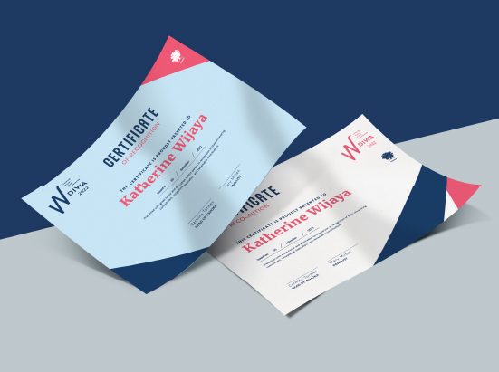
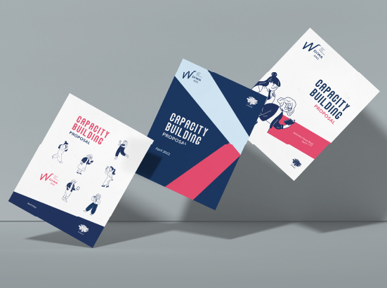
To ensure that DIWA stands out from other programs, we have developed a unique design incorporating a logo, complementary key visuals, and an application that aligns with DIWA's identity. Derived from the Sanskrit word for "goddess," DIWA represents the strength and courage of female social entrepreneurs who are driving tangible transformations in their communities. The design features an interconnected ribbon-like shape, symbolizing their determination to effect substantive change. By combining a vibrant pink with Ashoka's signature dark base blue color, the design achieves a contrasting blend that embodies both femininity and the gravity of their work.

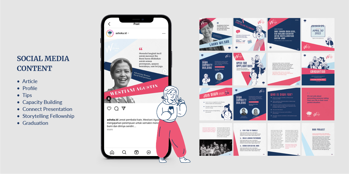
To further enhance DIWA's identity, we created illustrations portraying diverse female change-makers across various age groups and backgrounds. These illustrations are consistent with the artistic style previously established for Ashoka, ensuring a cohesive visual representation for DIWA.


This cohesive and distinctive design makes DIWA recognizable and differentiates it from other Ashoka programs. To assist our clients, we have provided the design in Canva templates, enabling easy utilization and encouraging creativity within the client teams.
By giving DIWA an unmistakable identity, we aim to amplify the impact of women social entrepreneurs and foster a sense of inclusivity within the larger Ashoka community.
Let's take your brand to the next level!
Taman Kemayoran Condomimium
Bougenville Tower 307
Jl. H. Benyamin Sueb
• Jakarta Pusat • 10630
Do you have a big passion for making a real difference? Join us!

© 2021 Designata Studio. All Rights Reserved