
-
Let's take your brand to the next level!
contact@designatastudio.com +62.822 9888 2757 -
Do you have a big passion for making a real difference? Join us!
jobs@designatastudio.com -
Taman Kemayoran Condomimium
Bougenville Tower 307
Jl. H. Benyamin Sueb • Jakarta Pusat • 10630
Year2020
ClientsPersonal Project
Scope of Works PACKAGING | IDENTITY
Website
Tenchan Rice Bowl
Maximizing brand identity with playful designs
When the pandemic struck Indonesia in 2020, the new for affordable take-aways food was highly increasing. Japanese modern rice-bowl with easy and simple packaging becomes the favorite option for young people who are Tenchan’s target market. Tenchan, with its tasty ala Japan menus, trust us to create and build the base of its brand identity.

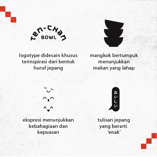
We create a logo of three bowls stacked on top of each other with happy expressions. This image shows how tasty Tenchan is that one rice bowl won’t be enough, you always want more. We use the Japanese writing style for their logo to emphasize its Japanese food influence. And next to the bowl we also add Japanese kanji which means delicious.
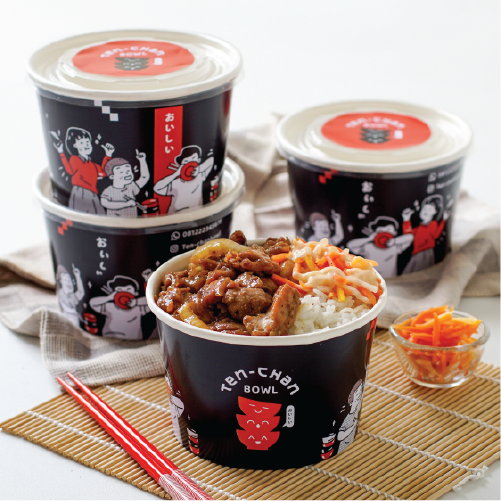
Along with these design elements, we also create 3 playful characters that deeply enjoy their food; one with his finger sticks out that shows he wants more of the food, one that is really focused on eating his food, and the last one holding the bowl with a wide smile on her face. We specifically make these characters for them to use as their communication tools to develop their brand image.


As for the color combination, since they have a limited budget, we want to maximize the packaging with minimum color and simple designs. We choose red and black contrast color combination to make the design pop up and appealing and have Japanese look. Even though the design uses minimum colors, it still looks appealing without having to make it appear as cheap.
Let's take your brand to the next level!
Taman Kemayoran Condomimium
Bougenville Tower 307
Jl. H. Benyamin Sueb
• Jakarta Pusat • 10630
Do you have a big passion for making a real difference? Join us!

© 2021 Designata Studio. All Rights Reserved