
-
Let's take your brand to the next level!
contact@designatastudio.com +62.822 9888 2757 -
Do you have a big passion for making a real difference? Join us!
jobs@designatastudio.com -
Taman Kemayoran Condomimium
Bougenville Tower 307
Jl. H. Benyamin Sueb • Jakarta Pusat • 10630
Year2020
Clients-
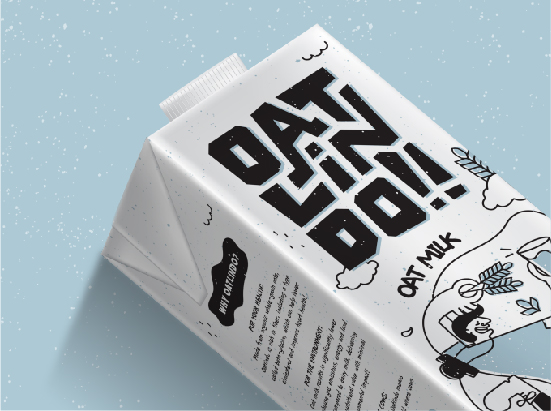
Scope of Works PACKAGING
Website
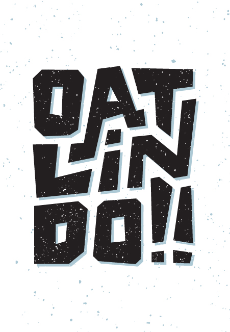
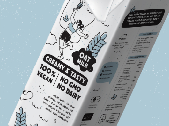
Oatlindo
Crafting Refreshing Plant-Based Beverages for the Modern Taste Explorer
As the trend of plant-based drinks captures the enthusiasm of the youth, Oatlindo takes center stage with its line of oat-based beverages, featuring two delightful flavor variants.
Derived from the fusion of "oat" and "Indo" (representing Indonesia), the brand name echoes a modern local identity. The logo is unique, sturdy, and compact, resembling a box base, ensuring prominence and clarity, especially in confined spaces.
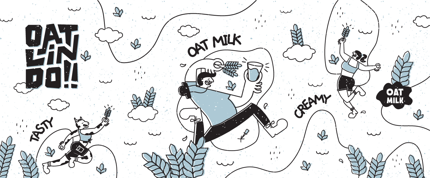
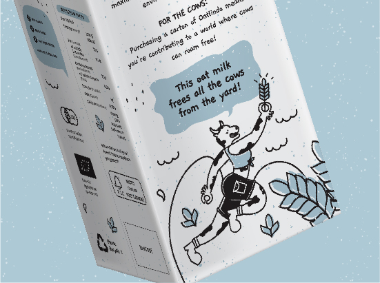
Embracing a cleaner and healthier taste concept, the packaging design adopts a white base, with a single additional color denoting each variant. Conveying the idea of a taste adventure, Oatlindo's packaging suggests a delicious plant-based experience that liberates cows from excessive milking exploitation. This positive message is delivered whimsically and uniquely, making Oatlindo exceptionally appealing to the discerning taste buds of the younger generation.


Let's take your brand to the next level!
Taman Kemayoran Condomimium
Bougenville Tower 307
Jl. H. Benyamin Sueb
• Jakarta Pusat • 10630
Do you have a big passion for making a real difference? Join us!

© 2021 Designata Studio. All Rights Reserved