
-
Let's take your brand to the next level!
contact@designatastudio.com +62.822 9888 2757 -
Do you have a big passion for making a real difference? Join us!
jobs@designatastudio.com -
Taman Kemayoran Condomimium
Bougenville Tower 307
Jl. H. Benyamin Sueb • Jakarta Pusat • 10630
Year2021
ClientsInti Karya Semesta
Scope of Works PACKAGING | IDENTITY | PRINTED MEDIA | DIGITAL MEDIA
Website https://wilsonsekrup.com/
Wilson Branding
Strong and edgy design for a sturdy Product
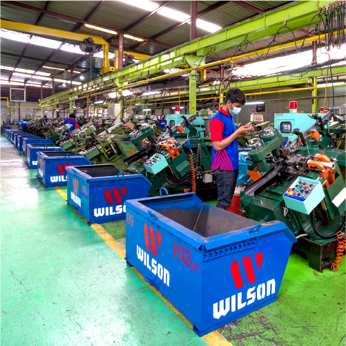
Every single material quality is vital when it comes to buildings. Wilson, an Indonesian screws company, offers their high-quality products to answer the market’s demand. Contractors can now find screws that are easy to install and remove due to their sharp and precise design.

There are already a few screws market leaders in Indonesia, Wilson needs to stand out among these crowds. We help to redesign their company profile, including website, packaging, and logo. Most of the screws' overall design is using a monochrome color which doesn’t illuminate their appearance among the same products in any building material store.


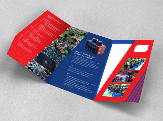
With this idea in mind, we create their design using contrast colors, red and dark blue, to be easily seen and create a powerful persona among their target market. We use their brand’s first initial as their logo, the letter “W” illustrate in lines, to represent their precise screws’ whorl in red color. We implement it as the main graphic in the packaging with a dark blue background to give it a strong contrast. For each product packaging, we use detailed illustrations to highlight the information and the advantages of the product.
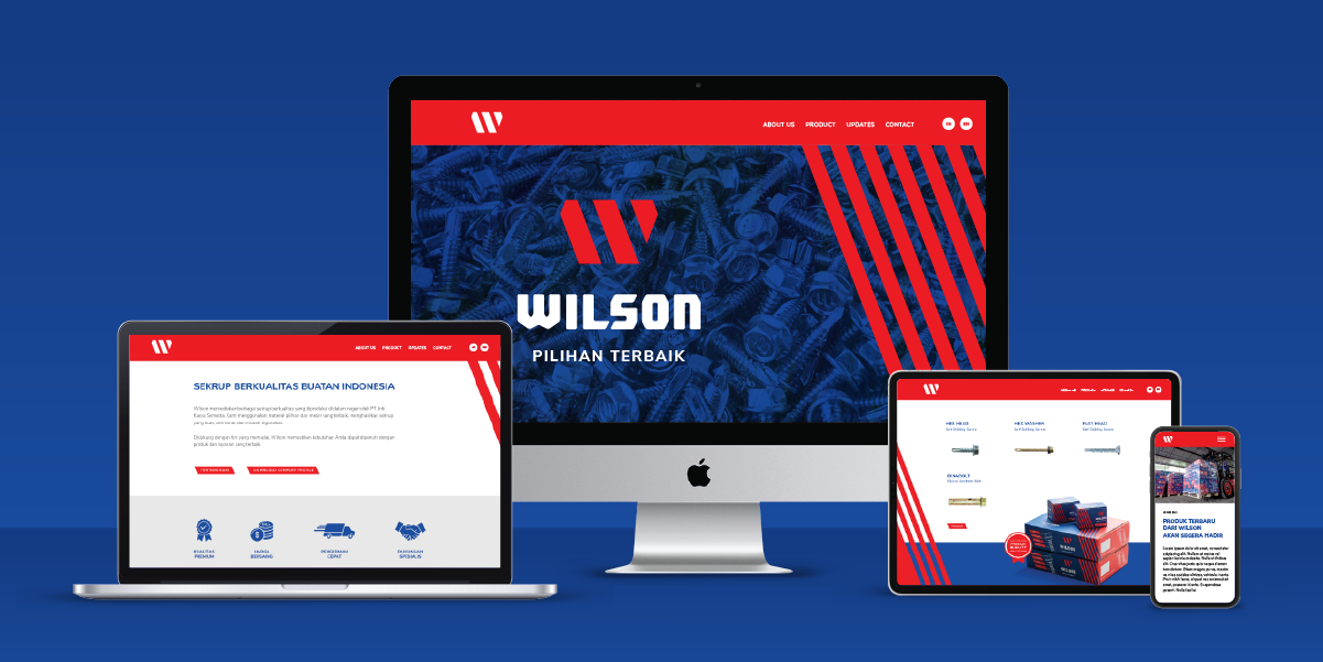

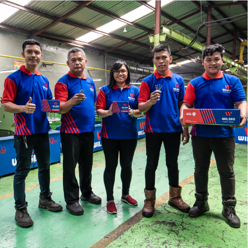
Their website is utilized to communicate the benefit of their products We add their promotional videos that tell their story and show the benefits of using their products. These design elements are applied to the t-shirt design as a bonus to their consumers. They also plan to spread place their banners in all the building material stores that they collaborate with to attract more consumers. Having a powerful and distinctive design, Wilson reserves their place on top of the screw pyramid market.
Let's take your brand to the next level!
Taman Kemayoran Condomimium
Bougenville Tower 307
Jl. H. Benyamin Sueb
• Jakarta Pusat • 10630
Do you have a big passion for making a real difference? Join us!

© 2021 Designata Studio. All Rights Reserved