Year2019
ClientsCathedral Jakarta
Scope of Works IDENTITY | PRINTED MEDIA | DIGITAL MEDIA | ENVIRONMENT & OTHERS
Website
Cathedral Jakarta Identity
The identity portrayal of historical values and future vision
The Jakarta Cathedral Church always has its own charm. Its historical values and architecture make it an iconic building, not only for the Catholics but also for the Jakarta residents in general. The building has unique and interesting details, from explicit to implicit symbols that are often used in the Catholic church.
Starting from our concern to their conventional visual identity, we think that it’s about time to revitalize the visual representation of the Cathedral to revoke the younger congregation to be more active in the Cathedral community.
The Challenge
Before we start designing their visual identity, we first need to study their history, the unique shapes of the Cathedral architecture, the public’s view of the church, and its vision and values. We need to have in-depth exploration to make sure that we include all the significant details of the Cathedral. To have the one divine symbol that resembles the Cathedral, we have to combine all these elements.



The Solution
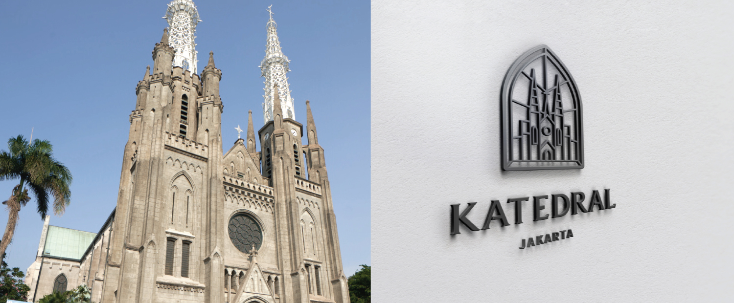
After going through a process of analysis and in-depth exploration, we conclude that the shape of the cathedral is the most epic point that distinguishes it from other churches. The whole facade of the Cathedral Church - a 2 towers neo-gothic building, is exceedingly an alluring view for both the Catholics and the surrounding community.
Inspired by this result, we decide to have the building itself as the logo. We illustrate the 2-towers gothic building surrounding with a frame, in symmetric vertical lines which symbolize the focus on God. The lines around the building embody the glowing light that resembles the vision of the Cathedral to radiate kindness to its surroundings. Each connecting lines reflect the relationship between all of the church congregation as a big family that unites in Catholic churches. The logotype itself is specially made in line with the font of the neo-gothic era with a bit of modern adjustment. The final touch is the light blue color that represents the patron saint of the Cathedral, the Blessed Virgin Mary. The logo as a whole component portrays the reformation vigor of the Cathedral to keep up and adjust with the changing era without needing to leave its core values.
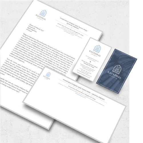
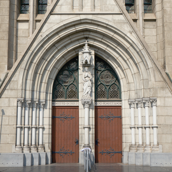
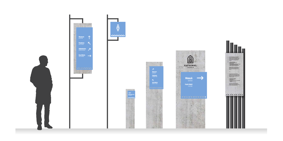
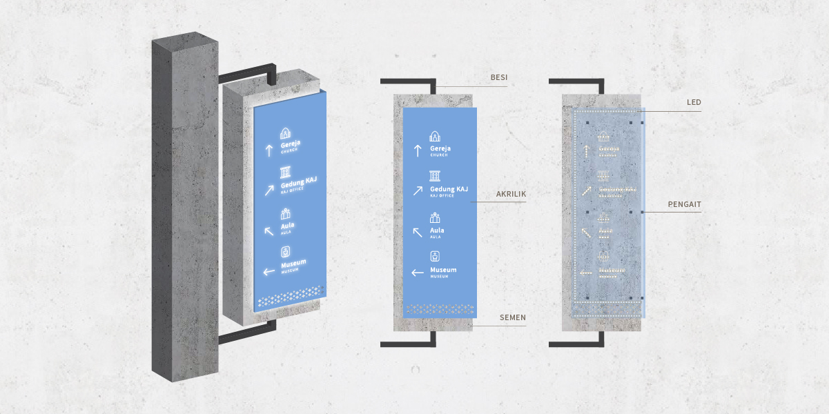
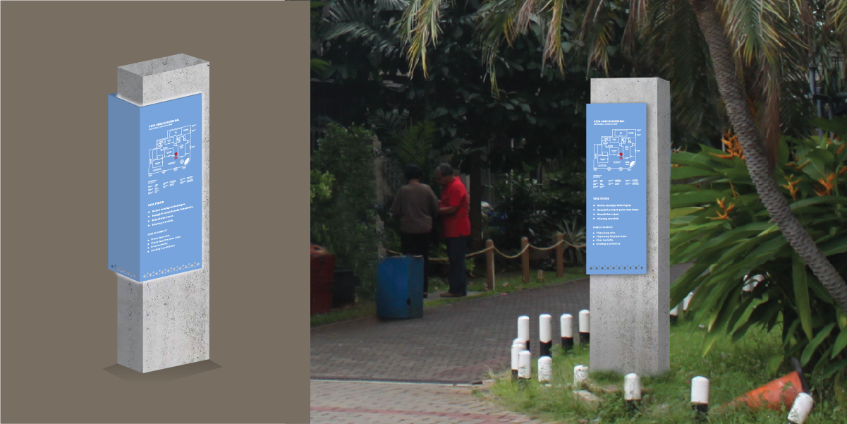
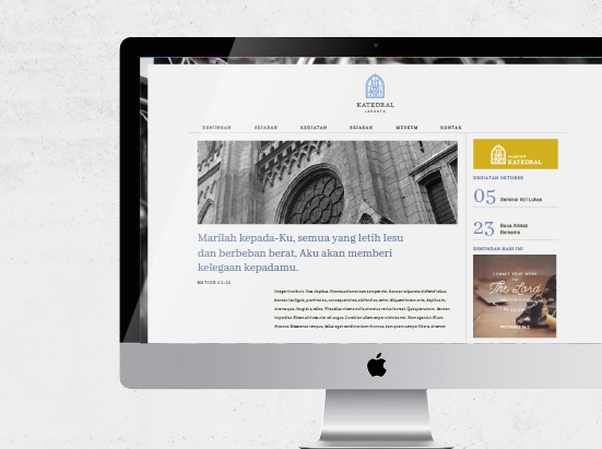
To complement this rejuvenated identity, we create supporting graphic elements to be used in various applications: stationary, websites, and signage systems. Our main inspiration for these designs is the interesting details around the Cathedral, such as the stained glass, the carving, etc. Some of the graphic patterns that we create were adapted from the stained glass around the church. We designed a series of icons to match the new logo shape for the signage. We categorized the signage based on its functions, information tools, directions, or warnings. This signage design is still in the development process since the buildings are still being renovated.

Aside from the graphic elements, we also design their 2019 calendar to effectively introduce the renewed identity while displaying the Cathedral’s relic historical details. In its modern yet rooted religious values, the Cathedral welcomes its younger congregation to take part in the Catholic community.

