Capturing caring and nurturing of mother’s love in packaging
Pigeon is a trusted baby care brand from Japan, dedicated to delivering high-quality and safe products for infants. Pigeon Baby Indonesia has provided us with the exciting opportunity to rejuvenate their packaging design. This is a significant challenge for us, as Pigeon is a well-established brand with strong market presence and recognition.
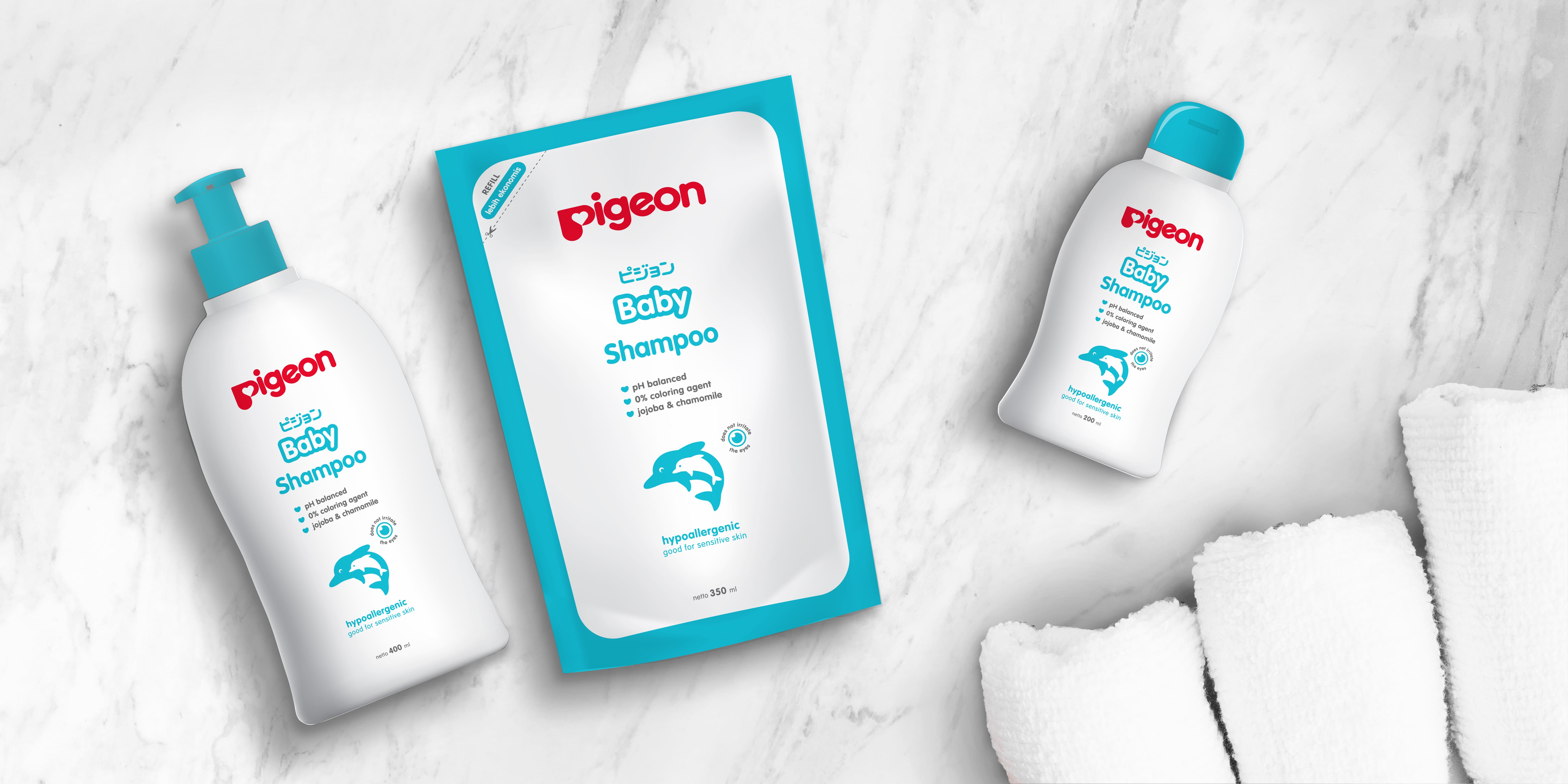
The client wants to maintain the same bottle design while updating its appearance to differentiate it from competitors, all while ensuring it remains recognizable to its customers. Our primary objective is to highlight the product's unique selling points (USPs) by incorporating engaging illustrative icons. We chose to use illustrations of mother and baby animals to convey the themes of care and protection, which lie at the core of this product.
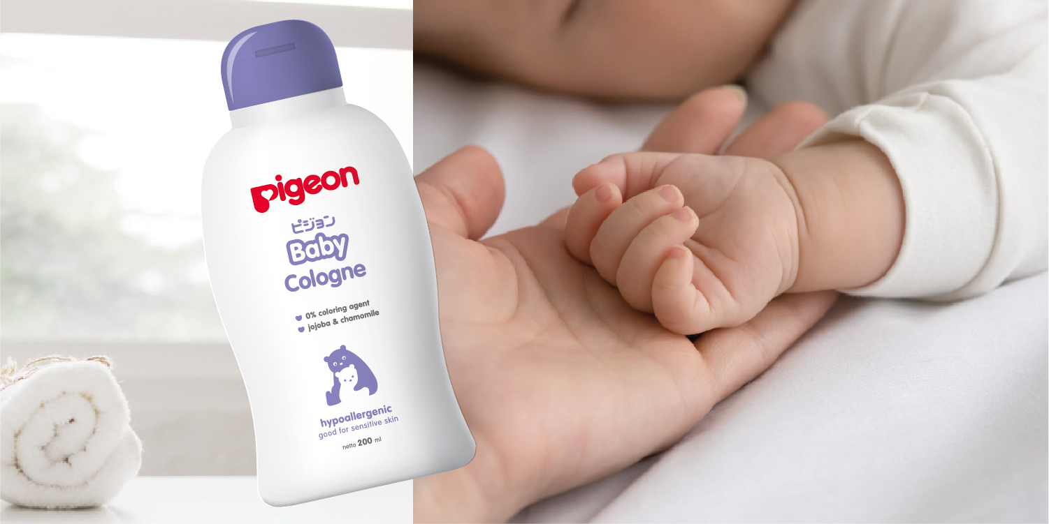
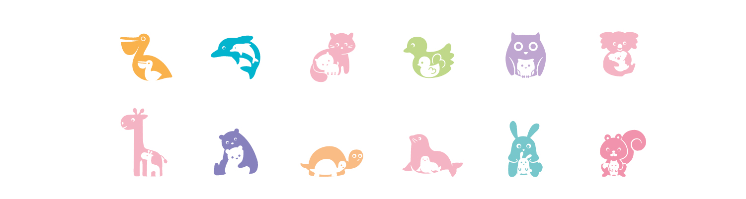
By employing a positive-negative form, we can navigate printing color limitations while infusing creativity into the illustrations using three distinct non-gradation colors. This approach is also aligned with the meaning of the letter "P" in the Pigeon logo, representing a mother and her baby's heart—a symbol of an unbreakable bond and deep love.
Pigeon offers 14 categories of baby care products, and we want to ensure that each category stands out, making it easier for parents to choose the right products. To achieve this, we have developed a color system that assigns a unique color combination to each category. This will assist mothers in easily selecting Pigeon Baby products by visually organizing the color-coded illustrations according to each product category.