Renew, Rebrand, Radiate. Bold Approach to Affordable Skincare
Every woman dreams of having glowing and healthy skin, and Kaila has embraced a rejuvenation of its brand to offer a comprehensive range of skincare products at accessible prices. We focus on young, confident women who want to be the center of attention. Positioned in the middle to lower price segment, our target market prioritizes affordability and the benefits of our products.
Launched initially as a line of toiletries, such as body lotion, Kaila is now pivoting to skincare products to align with the growing trend in the Indonesian market towards local brands. As a result, the brand needs to be rebranded to reflect this new direction.
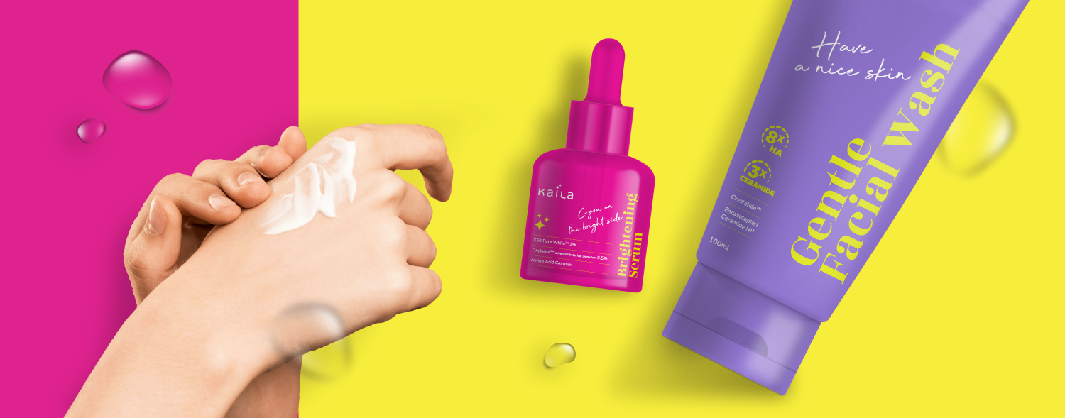
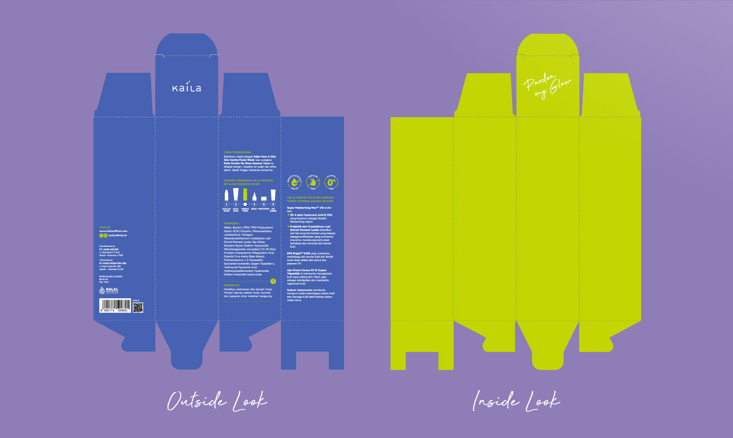
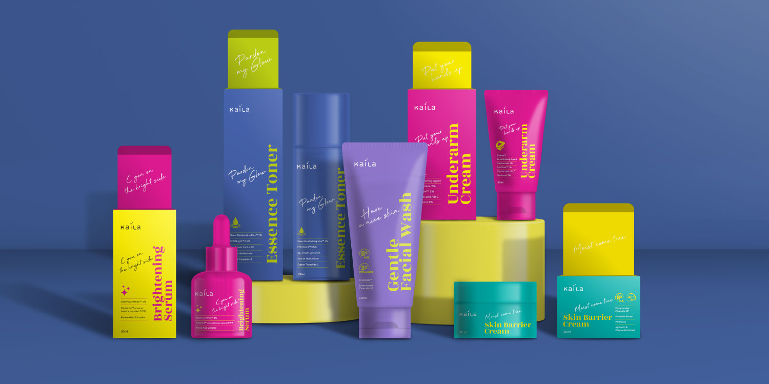
The design of the Kaila logo exudes confidence and simplicity. The few stars symbolize product efficacy and evoke an air of elegance. Its simplicity ensures ease of creation, validation, and readability. Kaila boasts a bold and trendy personality, presenting a modern, youthful, and fresh aesthetic through vibrant and contrasting colors that express its unique character.
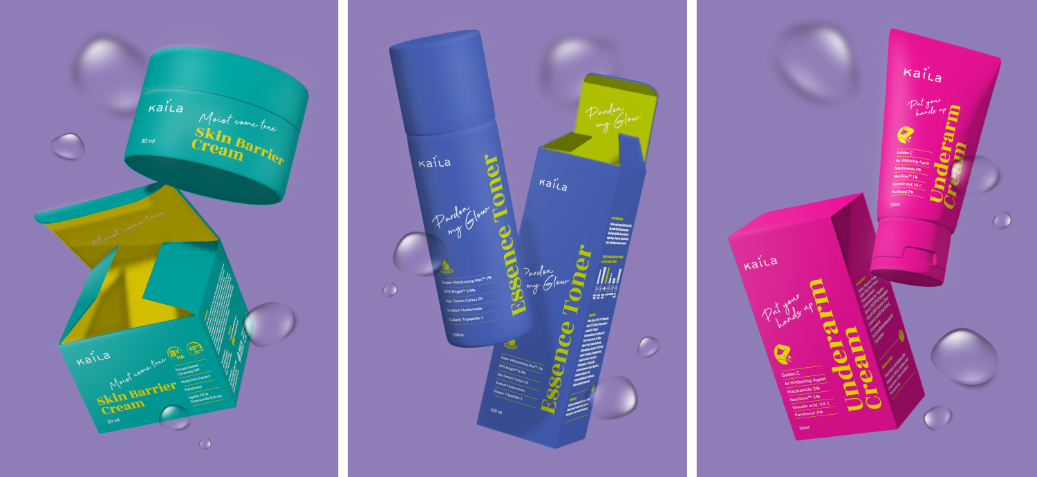
The front panel design features a catchy phrase to add a touch of humor. The rebranded Kaila appears modern and attractive, conveying its essence through a distinct combination of typography, layout, and colors. Icon designs that harmonize with the Kaila logo complement each product's unique selling proposition, highlighting it clearly and reinforcing Kaila's commitment to redefining skincare experiences.