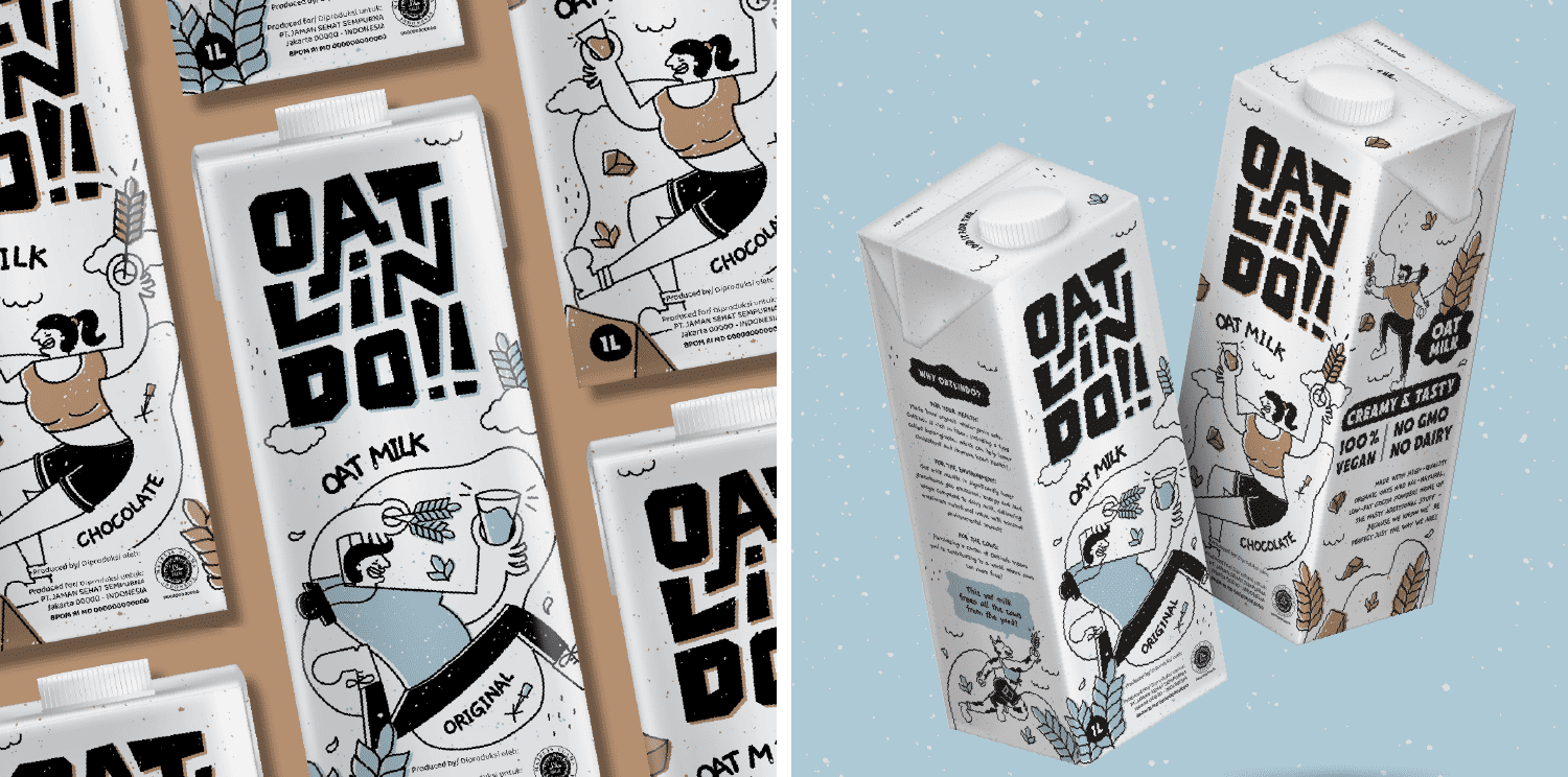
Crafting Refreshing Plant-Based Beverages for the Modern Taste Explorer
As the trend of plant-based drinks captures the enthusiasm of the youth, Oatlindo takes center stage with its line of oat-based beverages, featuring two delightful flavor variants. The brand name, derived from the fusion of "oat" and "Indo" (representing Indonesia), echoes a modern local identity. The logo is unique, sturdy, and compact, resembling a box base, ensuring prominence and clarity, especially in confined spaces.
Embracing a cleaner and healthier taste concept, the packaging design adopts a white base, with a single additional color denoting each variant. Conveying the idea of a taste adventure, Oatlindo's packaging suggests a delicious plant-based experience that liberates cows from excessive milking exploitation. This positive message is delivered whimsically and uniquely, making Oatlindo exceptionally appealing to the discerning taste buds of the younger generation.