Renewable energy for a brighter today and tomorrow
Kencana Energy is a private company focused on renewable electricity. Unlike other conventional public and private electricity companies, we are committed to establishing a unique position with a modern and dynamic work environment. Our goal is to create a compelling brand that emphasizes quality and distinguishes Kencana Energy from its competitors.
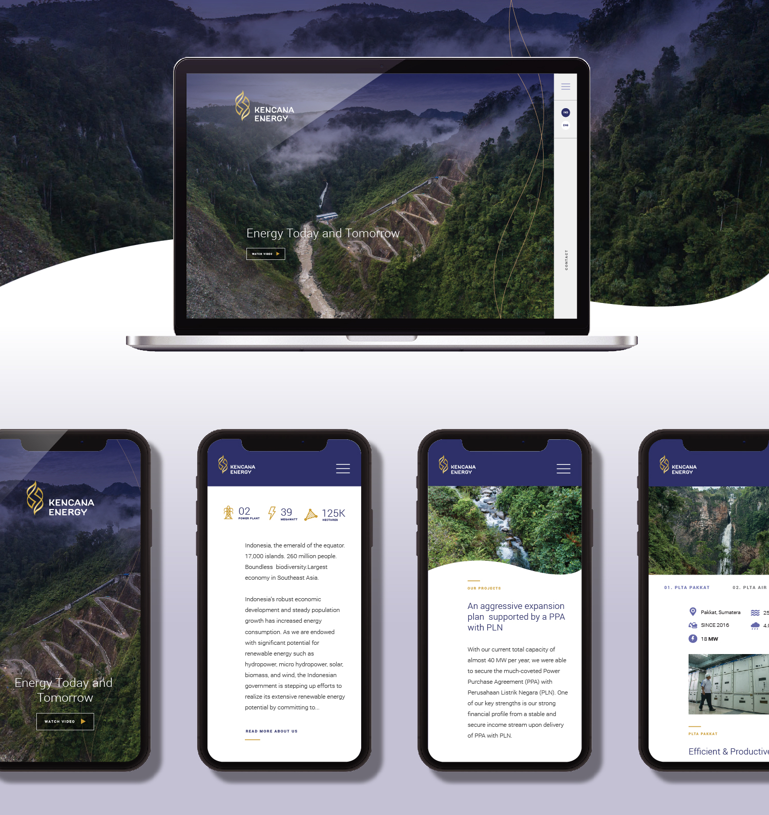
We design comprehensive branding elements that effectively represent Kencana Energy and its vision. This includes the development of their website, corporate profile book, company profile video, stationery, merchandise, bumper animations, invitations, and uniforms, ensuring consistency across all brand components for both regular and launch purposes.


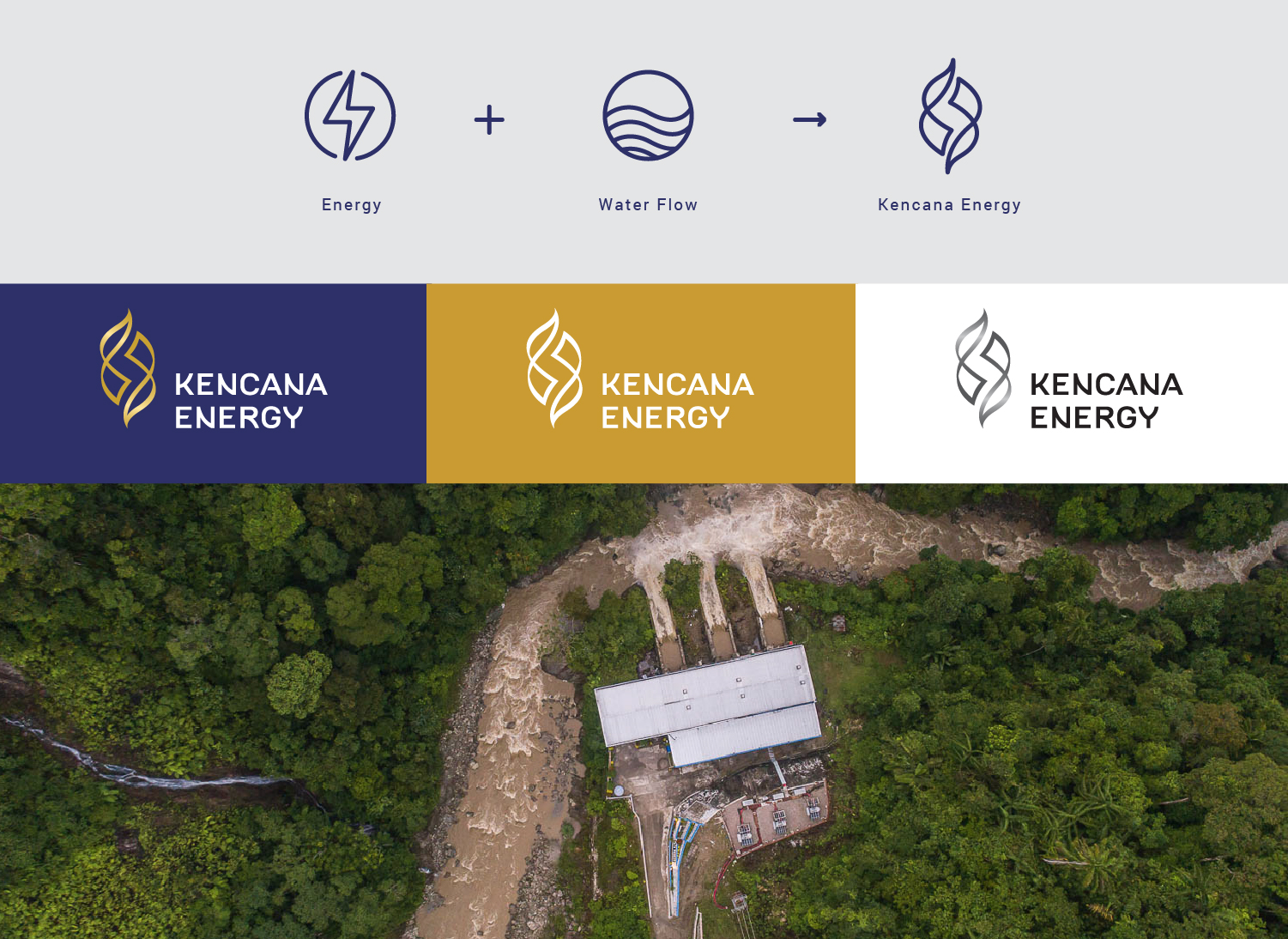
Our logo design is inspired by the symbols of electricity waves and flowing water, merging these two elements to convey a sense of dynamism and openness to change and opportunities. The logo reflects harmonious movement, representing Kencana Energy’s mission to collaborate with major stakeholders to become Indonesia and Southeast Asia's largest renewable energy company. The logo's color is derived from the meaning of "Kencana," which signifies gold, combined with a dark purple shade that symbolizes maturity, trust, and professionalism.
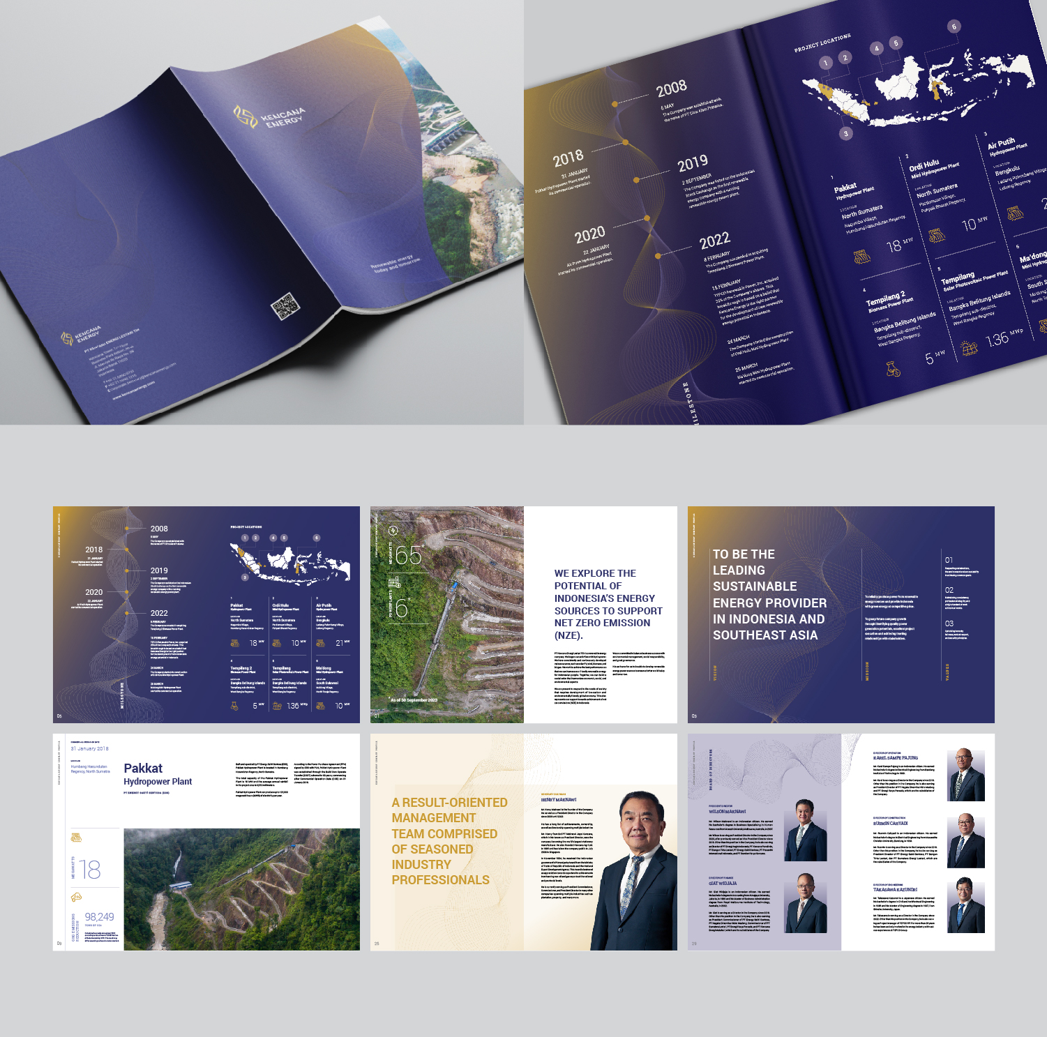
When designing the corporate profile book, we prioritize making a powerful impression by introducing the company to potential investors. To ensure clarity and brevity, we present the content in a simple, modern, and elegant manner that effectively communicates Kencana Energy's overall vision and mission, as well as its potential. The guideline book includes visuals of some of their power plant locations to illustrate the scale and potential of their business.


