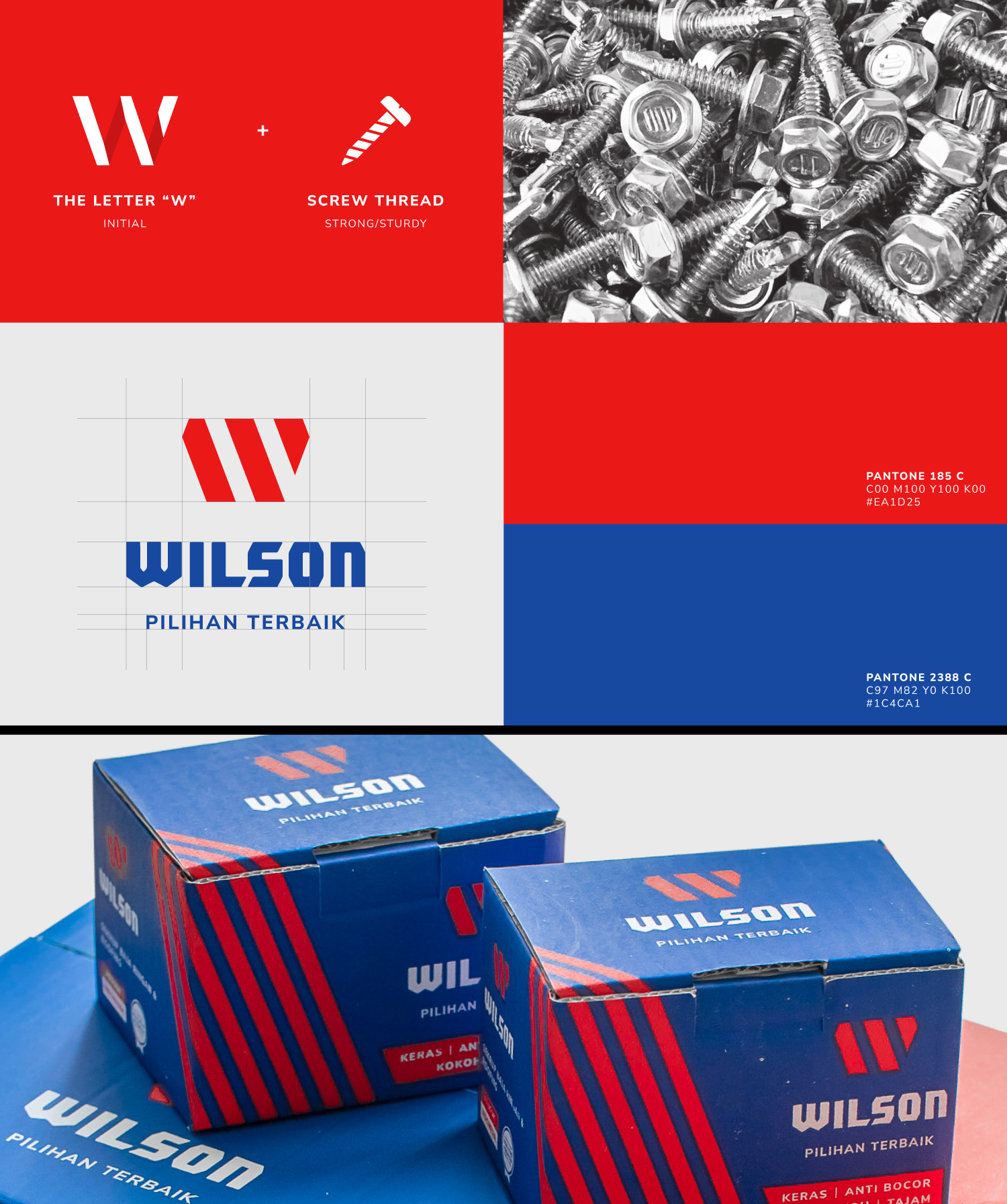
Strong and edgy design for a sturdy product
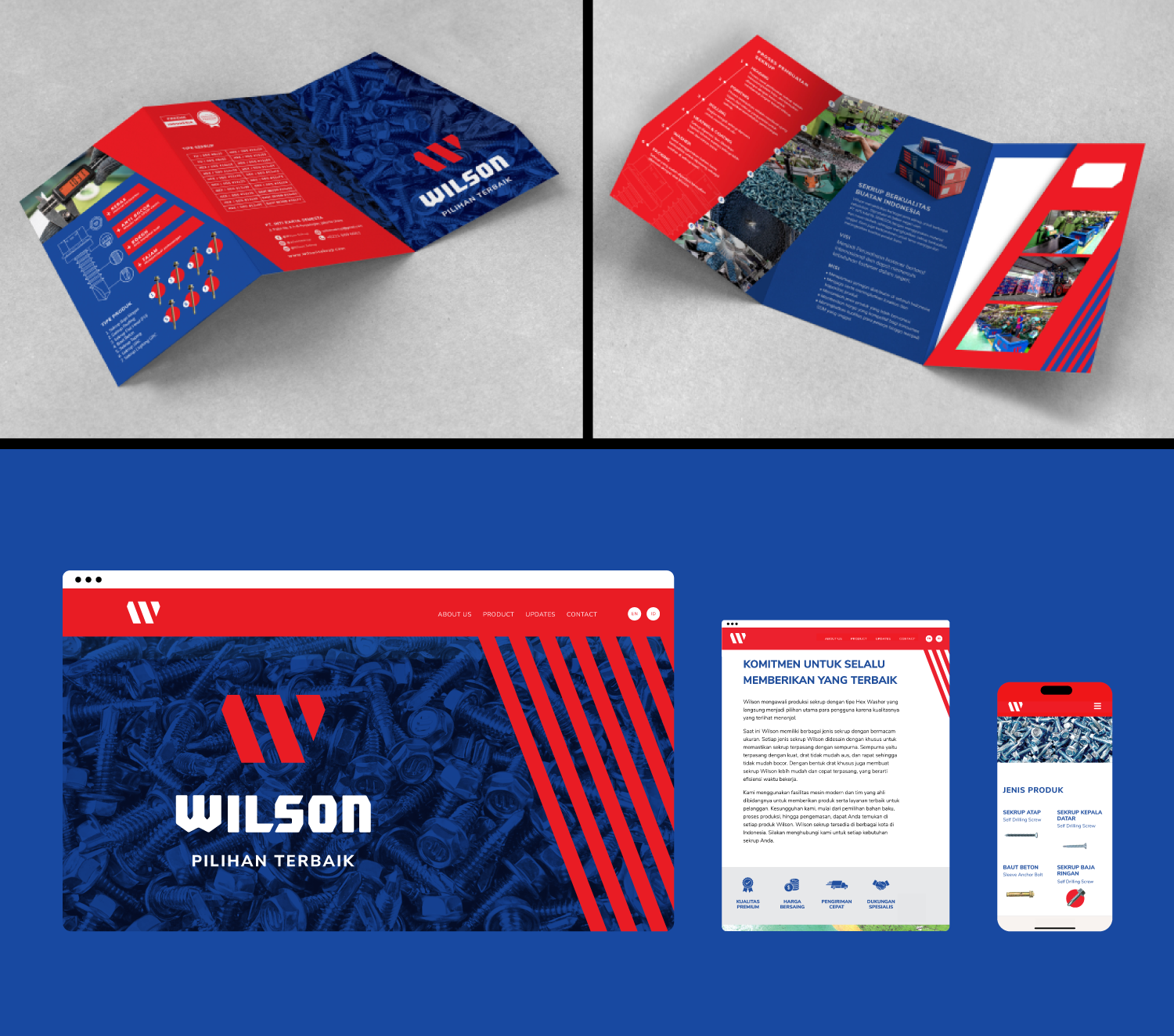
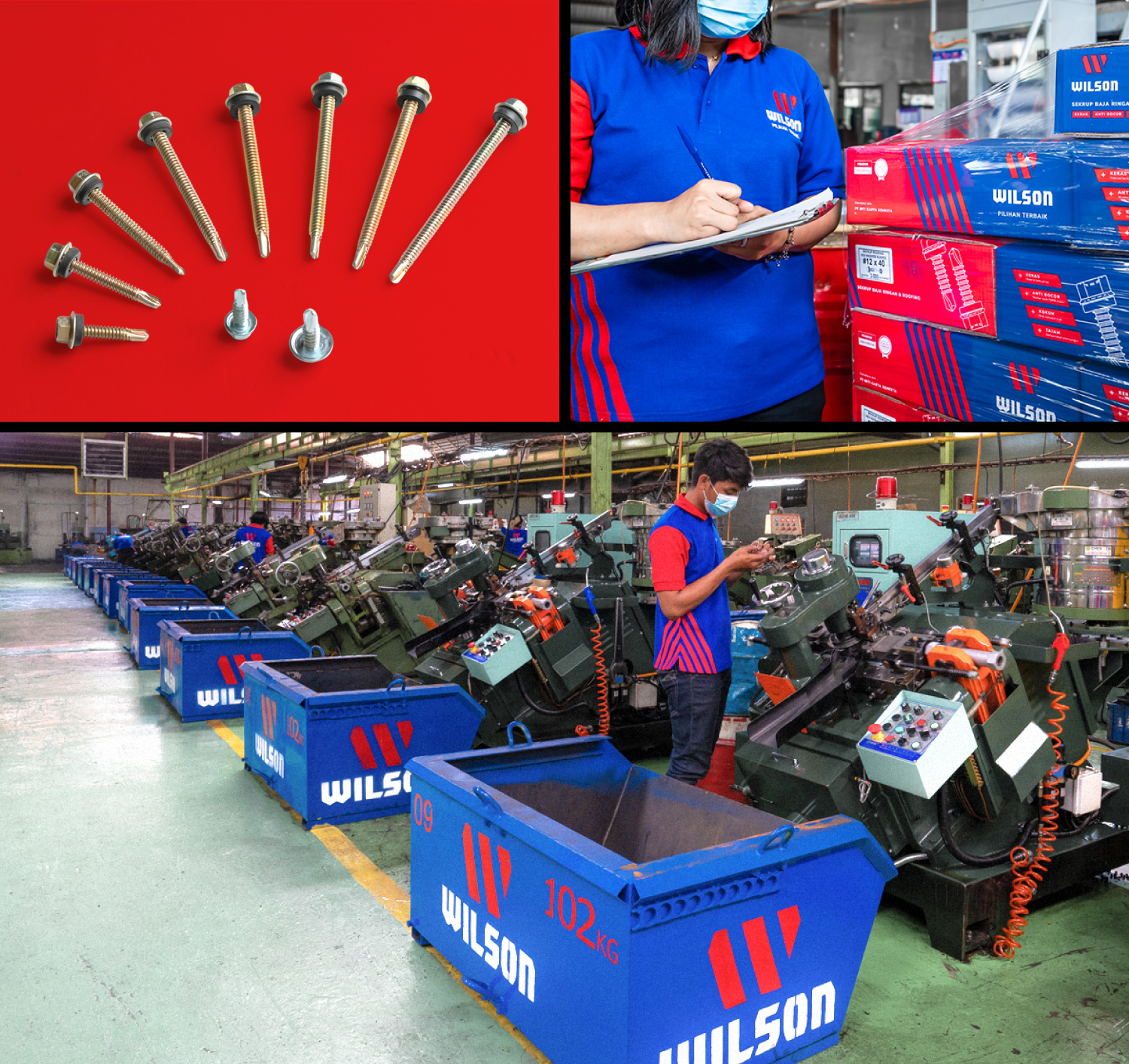
Every aspect of material quality is essential in construction. Wilson, an Indonesian screw company, provides high-quality products to meet market demand. Contractors can now find screws that are easy to install and remove, thanks to their sharp and precise design. With several leading screw brands in Indonesia, Wilson needs to differentiate itself among the competition. We assist in redesigning their company profile, which includes the website, packaging, and logo. Most screw designs currently use monochrome colors, making it difficult for them to stand out in building material stores.
To address this, we created a design featuring contrasting colors—red and dark blue—to enhance visibility and establish a strong brand presence in the target market. We used the brand's initial, the letter “W,” illustrated in lines, to symbolize their precise screws in red. This design serves as the main graphic on the packaging against a dark blue background, providing a striking contrast. Each product package features detailed illustrations that highlight key information and advantages.
We designed their website to effectively communicate the benefits of the products. Promotional videos were included to share the company’s story and demonstrate the advantages of using their screws. These design elements have also been applied to t-shirt designs as an added bonus for consumers. Additionally, we provided display banners as part of the strategy to introduce the brand in all collaborating building material stores to attract more customers. With a powerful and distinctive design, Wilson aims to secure its position at the top of the screw market, supported by our expertise as consultants.