Rejuvenate an established brand without losing its identity
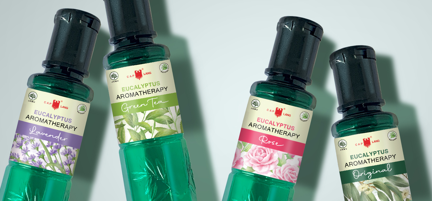
Cap Lang MEA (Minyak Eucalyptus Aromatherapy) is a product from the widely known Cap Lang brand. It’s an eucalyptus aromatherapy oil with four fragrances: original, lavender, rose, and green tea. Our main work is to rebrand Cap Lang’s sub-brand to make it stand out and reach a younger target market without having to lose its fundamental identity.
The challenge:
This product is a sub-brand of Cap Lang that uses eucalyptus as the base oil, enhanced with aromatherapy elements. Unlike their cajuput oil product, which targets an older demographic, this eucalyptus aromatherapy product aims to attract a younger audience. They have been using the same bottle design for both their cajuput oil and eucalyptus oil products, with the only distinction being the caps. As a result, consumers may have difficulty differentiating between the two products.
The solution:
To balance keeping their famous packaging and making it more modern and appealing, we create new illustration designs that integrate with their existing packaging. We still keep their trademark bottle with just a little bit of adjustment. We use different colors for the bottles and caps to distinguish the eucalyptus from the cajuput. By maintaining their trademark and complementing it with a label design that’s fresher, aromatic, and modern, their existing consumers easily recognize their new products. We apply different color combinations for each variant to create a strong identity and assist consumers in choosing the desired fragrance. Conventional doesn’t have to look negative and boring; we maintain and adjust it into something more appealing and trusted.