Cost efficiency does not prevent us from creating a playful design
When the pandemic struck Indonesia in 2020, the demand for affordable take-away food surged. Japanese modern rice bowls with simple packaging quickly became a favorite among young people, the primary target market for Tenchan. Tenchan, known for its delicious Japanese-inspired menu, entrusted us with the task of developing its brand identity.
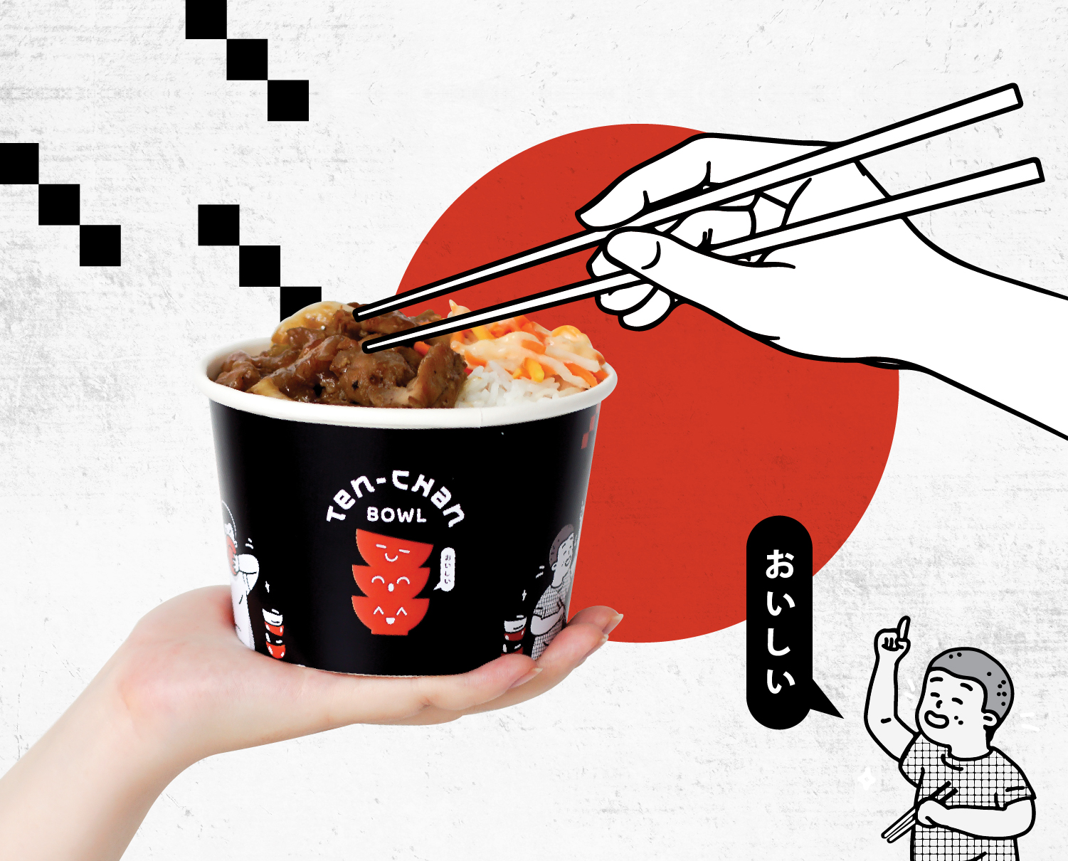
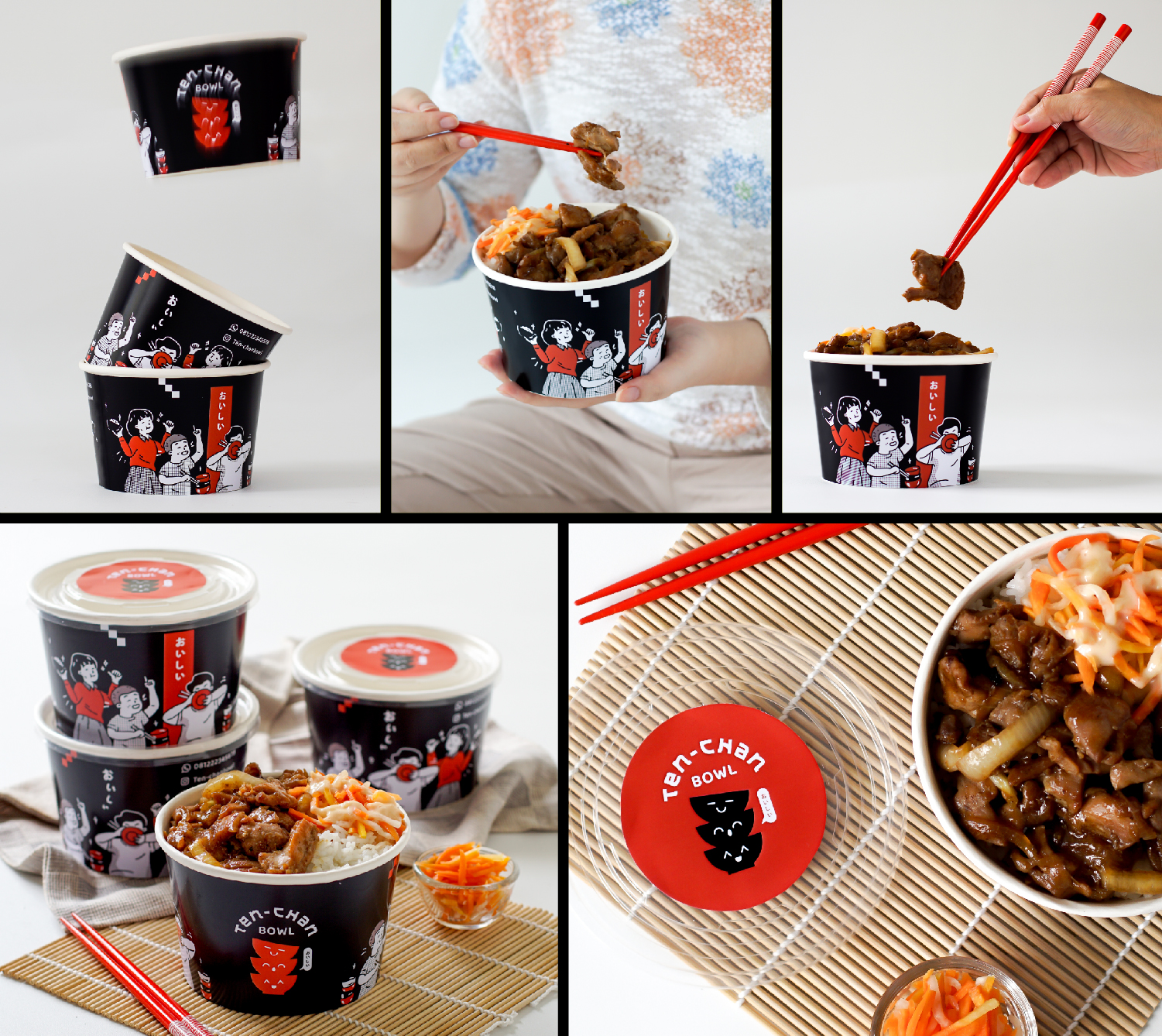
We designed a logo featuring three stacked bowls, each with happy expressions. This imagery conveys how tasty Tenchan’s offerings are, suggesting that one rice bowl is never enough; customers will always want more. To highlight the Japanese influence in the cuisine, we used a Japanese writing style for the logo, accompanied by kanji characters that mean "delicious."

In addition to these design elements, we created three playful characters that express their enjoyment of food: one character with a finger raised, indicating a desire for more, another intensely focused on eating, and a third holding a bowl with a wide smile. These characters were specifically designed to be used as communication tools to enhance Tenchan's brand image.
For the color scheme, considering their limited budget, we aimed to maximize the packaging's impact with minimal colors and simple designs. We chose a striking red and black contrast to make the design stand out while maintaining a Japanese aesthetic. Despite using a limited color palette, the design remains appealing and does not come across as cheap.


